
Updated: August 12th, 2026 for FolioBlocks Version 1.5
Note: The Modular Gallery Block is only included in the paid (Pro) version of FolioBlocks.
The Modular Gallery Block in FolioBlocks lets you create visually striking, magazine-style photo layouts directly inside the WordPress Block Editor (Gutenberg). It combines the precision of the Justified layout with the flexibility of custom image rows and image stacks, giving you complete creative control over how your images are arranged.
Table of Contents
What Is the Modular Gallery Block?
The Modular Gallery Block is a unique, row-based gallery system that allows you to build your gallery section by section. Each row is made up of images that automatically scale to fill the full width of the page, maintaining their original aspect ratios — much like a justified gallery — but with the added ability to group and design each row individually.
This layout style is inspired by editorial photo essays and magazine spreads, where visual storytelling depends on rhythm and structure. It’s ideal for photographers who want to build customized, narrative-driven galleries rather than uniform grids.
Perfect for:
- Portfolio showcases with varied image groupings
- Editorial or storytelling layouts
- Magazine or publication-style photo features
- Hero galleries and homepage sections
How to Add the Modular Gallery Block
1. Insert the Block
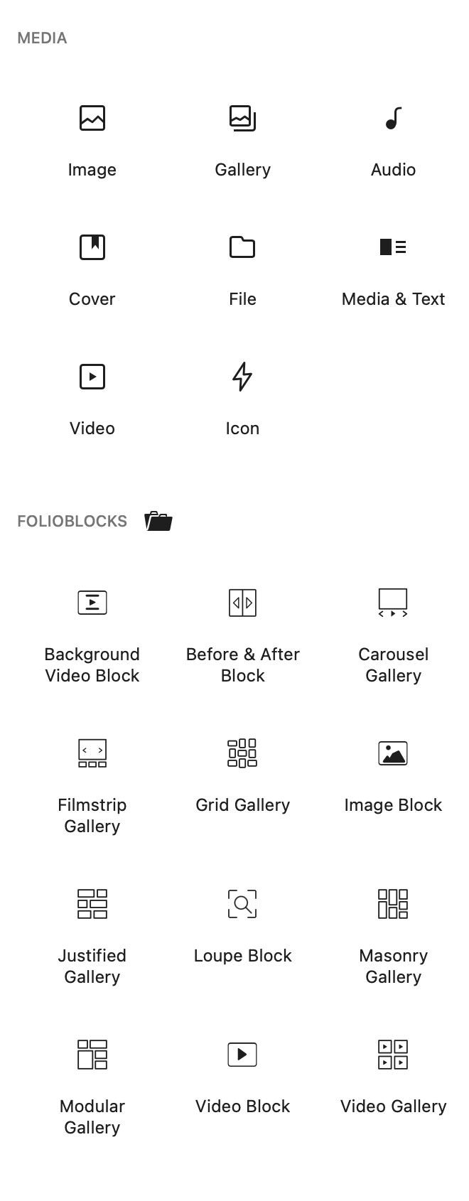
In the WordPress Block Editor, click the ➕ Add Block button and search for “Modular Gallery.” You’ll find it under the FolioBlocks section.
2. Building the Gallery with Image Rows & Image Stacks
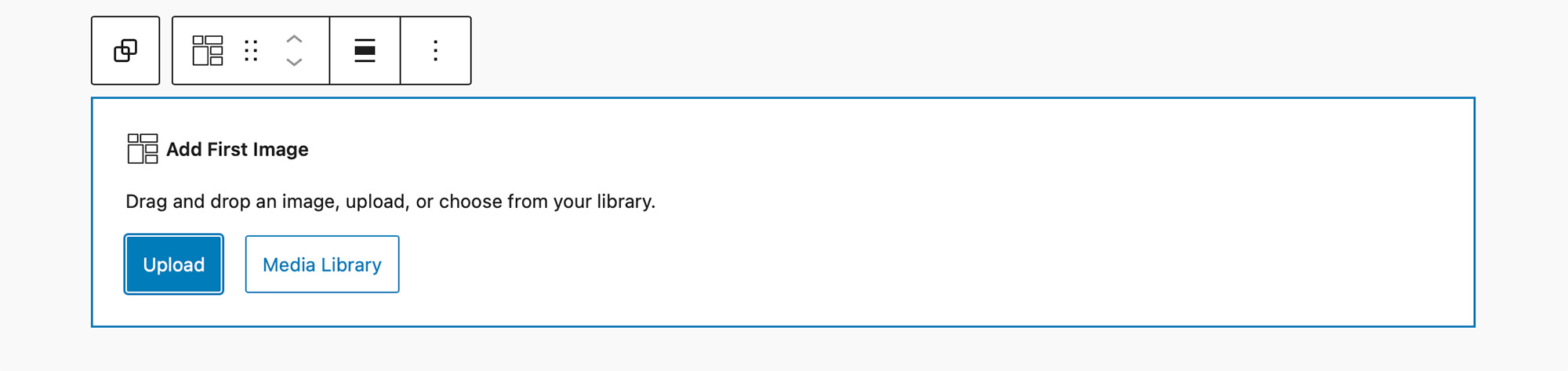
The Modular Gallery Block is unique in that you construct your gallery an image at a time. With the block added to the editor you are prompted to select your first image.
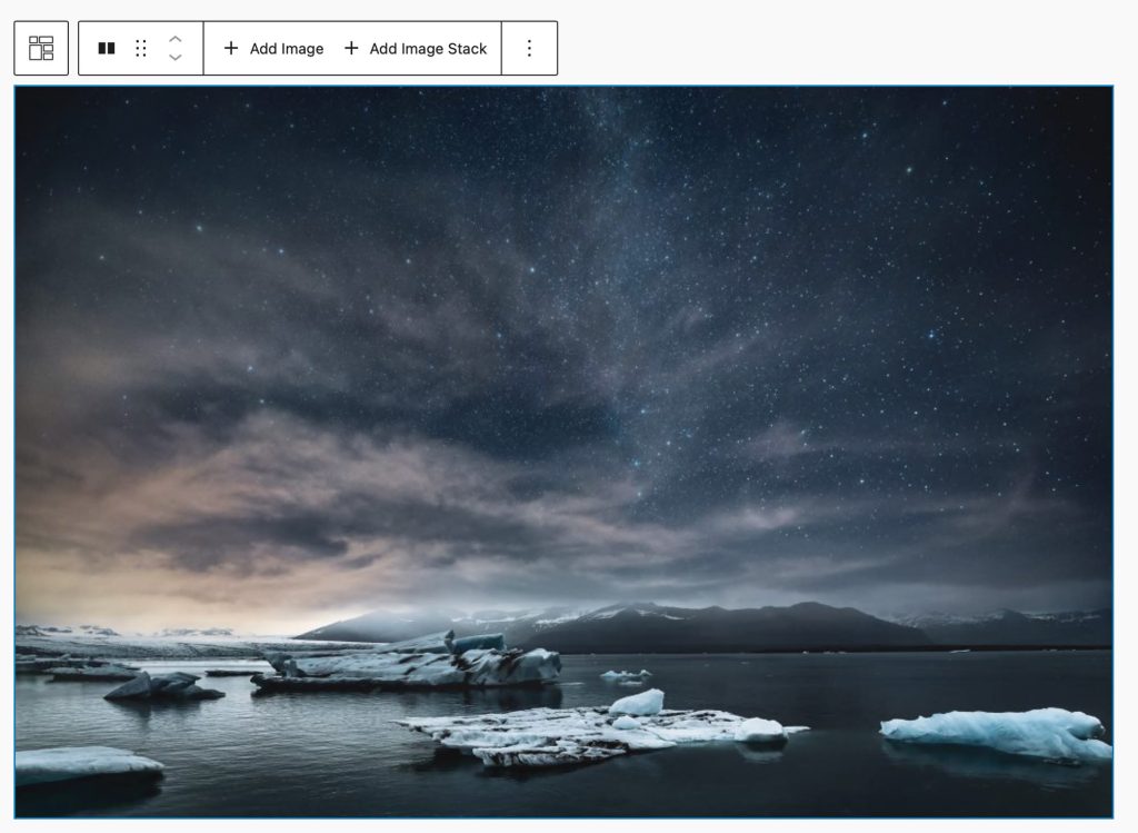
When you have added your first image you will notice that it has filled out the entire width of the gallery as in the example below:
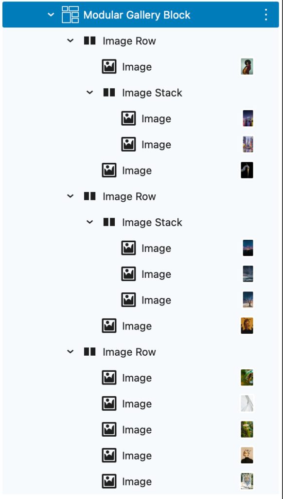
If you examine the Modular Gallery Block’s structure in the List View you will see that your image has been added inside an Image Row. An Image Row always fills edge to edge. Since we only have one image in our row it filled out the entire width of the row.
Let’s add a second image into the Image Row:
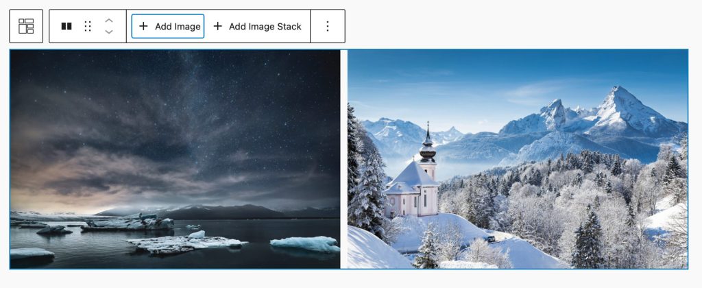
With a second image added, you’ll see that it and our original image has been resized in order to fill out the row edge to edge.
Now let’s take it a step further, inside of your Image Rows you can also add an Image Stack. An Image Stack is similar to an image row only that images placed inside of it are stacked one on top of another. The Image Row views the Image Stack as a singular unit and resizes it so it can fill out the row with the other images.
In the example below we have added an Image Stack into our original Image Row and inside of the Image Stack we have added two images.
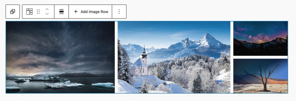
This combination of Image Rows and Image Stacks allows you to construct a wide variety of layouts where you give visual preference in terms of size to images as you see fit.
3. Arrange and Customize
Like all the other galleries in FolioBlocks, the Modular Gallery displays images as inner blocks. This means that the List View makes it super easy to rearrange your gallery and modify your layout. Images can be dragged and dropped in and out of Image Rows and Image Stacks. Image Stacks can also be dragged and dropped from one Image Row to another.
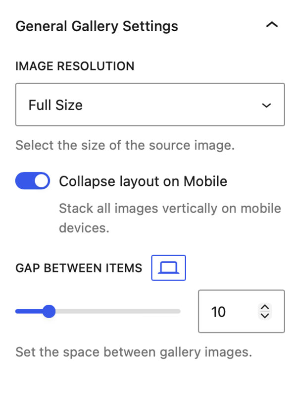
General Gallery Settings
Image Resolution
Choose between Thumbnail, Medium, Large, or Full image resolutions to optimize quality and performance.
Collapse layout on Mobile
The Modular Gallery Block by default will maintain its layout even on mobile phones, the idea being that it might be often used on presentational galleries where the size of the image is meant to convey a message.
Activate this toggle if you prefer for it to collapse into a single column of images on mobile.
Gap Between Items
The Gap Between Items slider allows you to define the amount of space between images with options to set different values for Desktop, Tablet, and Mobile.
Gallery Click Settings
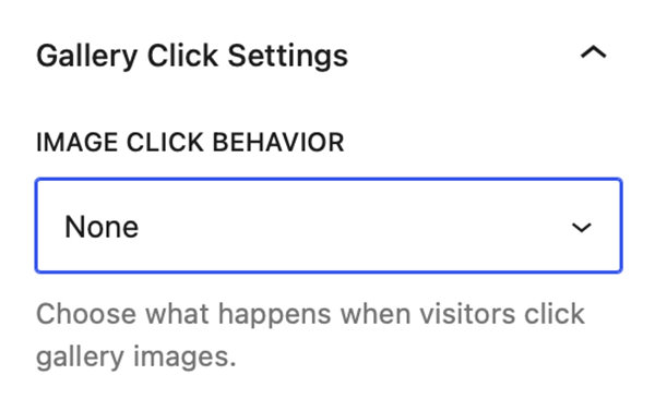
All features related to what happens when you click on a gallery image are grouped into a panel called Gallery Click Settings. Clicking on the Image Click Behavior dropdown reveals the following options: None, Open in Lightbox, Enable Image Downloads, Link Image to Media File, Link Image to Custom URL, Link Image to Page/Post, or WooCommerce Product.
Note: WooCommerce Product only displays if WooCommerce is installed and active
Lightbox
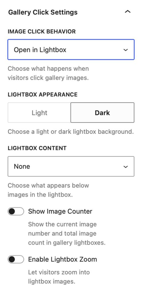
Selecting Open in Lightbox in the Image Click Behavior dropdown will activate the Lightbox on the website’s front end. The Lightbox supports keyboard navigation and swipe gestures and full-screen mode.
When Open in Lightbox is selected in Image Click Behavior a control for Lightbox Appearance allows you to switch between the Lightbox’s Light & Dark modes.
An additional dropdown titled Lightbox Content allows you to select what displays inside of the Lightbox alongside the image. You can select from:
- None
- Show Image Title
- Show Image Caption
- Show EXIF Data
- Show Image Title & EXIF Data
- Show Image Caption & EXIF Data
- Show Image Title & Caption
- Show Image Title, Caption, & EXIF Data
- Show Social Media
Lastly, there are two toggle controls. Show Image Counter displays the current image number and total number of gallery images in the top-left corner of the Lightbox. Enable Lightbox Zoom lets users double-click the image, or click the magnifying glass icon in the bottom-right corner of the Lightbox, to enter zoom mode where they can drag and pan around the image.
Enable Image Downloads
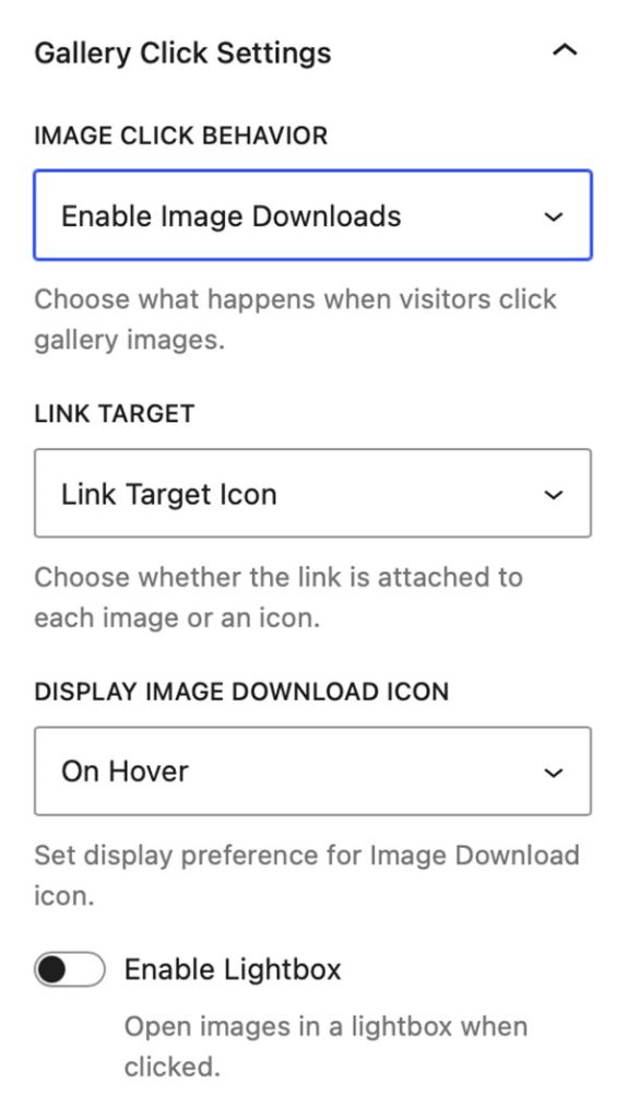
Selecting Enable Image Downloads in the Image Click Behavior dropdown will make all of the gallery images link to the source file so they are available for download in the front end of the website.
The Link Target dropdown lets you decide if you want the link to be placed on an icon or on the thumbnail image.
The Display Image Download Icon drop down allows you to select if the Download icon is always displayed, displayed on hover, or never displayed.
Note: With Enable Image Downloads selected an additional control is added into the gallery block’s Styles panel. This control allows you to set the color of the Download icon as well as its background color.
Finally the Enable Lightbox control allows you to toggle and activate the Lightbox, when activated will display additional Lightbox controls for Lightbox Appearance and Lightbox Content.
Note: This is only available when the Link Target dropdown is set to Link Target Icon.
Link Image to Media File
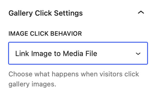
Selecting Link Image to Media File in the Image Click Behavior dropdown will make all the gallery thumbnails link to their source file. However clicking the link will not trigger a download but open the source file in the browser.
This setting is useful if you want to use a third-party Lightbox rather than the Lightbox that is included with FolioBlocks.
Link Image to Custom URL
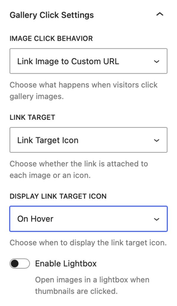
Selecting Link Image to Custom URL in the Image Click Behavior dropdown will allow you to link the gallery images to custom URLs. Linking is done on the individual Image blocks from a search field that is added to their Settings panel.
Note: Images that are not linked will not have an empty hyperlink added.
The Link Target dropdown lets you decide if you want the link to be placed on an icon or on the thumbnail image.
The Display Link Target Icon drop down allows you to select if the Link icon is always displayed, displayed on hover, or never displayed.
Note: With Link Image to Custom URL selected an additional control is added into the gallery block’s Styles panel. This control allows you to set the color of the Link icon as well as its background color.
Finally the Enable Lightbox control allows you to toggle and activate the Lightbox, when activated will display additional Lightbox controls for Lightbox Appearance and Lightbox Content.
Note: This is only available when the Link Target dropdown is set to Link Target Icon.
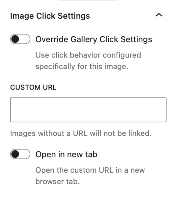
When the Image Click Behavior setting on the gallery block is set to Link Image to Custom URL, you can then select any individual Image Block within the gallery and link it directly to a custom URL.
To do this, open the Image Block’s Settings panel and expand the Image Click Settings panel. There you’ll find a searchable field that lets you quickly enter a custom URL.
For faster access, a Link button is also available in the Image Block toolbar. Clicking this button opens the same URL selection interface.
Link Image to Page/Post
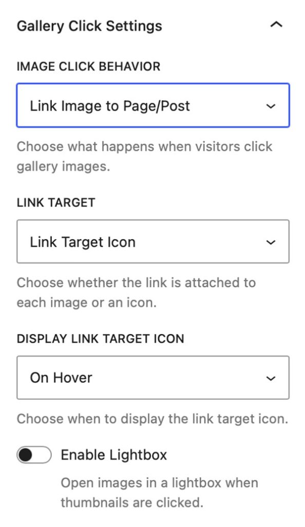
Selecting Link Image to Page/Post in the Image Click Behavior dropdown will allow you to link the gallery images to Pages or Posts on your WordPress site. Linking is done on the individual Image blocks from a search field that is added to their Settings panel.
Note: Images that are not linked will not have an empty hyperlink added.
The Link Target dropdown lets you decide if you want the link to be placed on an icon or on the thumbnail image.
The Display Link Target Icon drop down allows you to select if the Link icon is always displayed, displayed on hover, or never displayed.
Note: With Link Image to Page/Post selected an additional control is added into the gallery block’s Styles panel. This control allows you to set the color of the Link icon as well as its background color.
Finally the Enable Lightbox control allows you to toggle and activate the Lightbox, when activated will display additional Lightbox controls for Lightbox Appearance and Lightbox Content.
Note: This is only available when the Link Target dropdown is set to Link Target Icon.
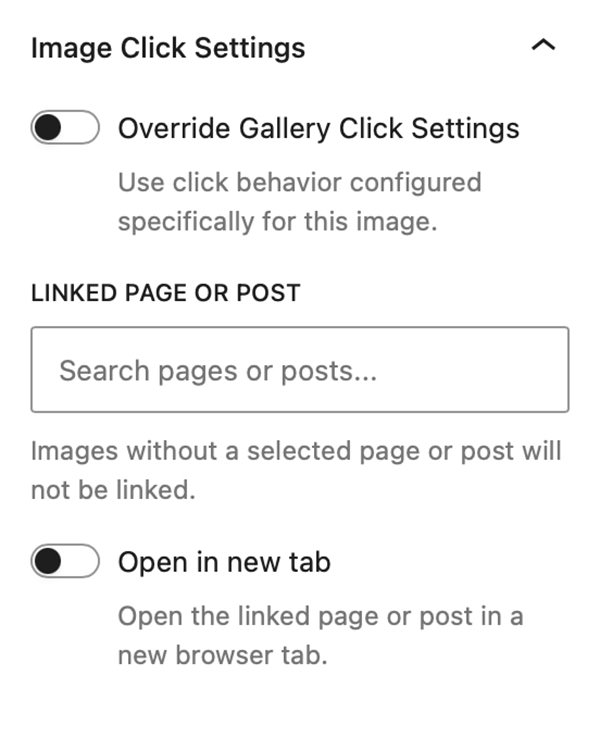
When the Image Click Behavior setting on the gallery block is set to Link Image to Page/Post, you can then select any individual Image Block within the gallery and link it directly to a page or post on your WordPress site.
To do this, open the Image Block’s Settings panel and expand the Image Click Settings panel. There you’ll find a searchable field that lets you quickly find and select a page or post from your WordPress website.
For faster access, a Link button is also available in the Image Block toolbar. Clicking this button opens the same Page/Post selection interface.
WooCommerce Product
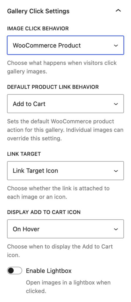
Selecting WooCommerce Product from the Image Click Behavior dropdown will allow you to link the gallery images to WooCommerce products in your WordPress website. Linking is done on the individual Image blocks from a search field that is added to their Settings panel.
Note: This option is only available when the WooCommerce plugin is installed and active. Images that are not linked will not have an empty hyperlink added.
The Default Product Link Behavior dropdown lets you decide if you want the link to add a product to your shopping cart or if you want the link to go to the selected product’s page.
The Link Target dropdown lets you decide if you want the link to be placed on an icon or on the thumbnail image.
The Display Add to Cart Icon drop down allows you to select if the Link icon is always displayed, displayed on hover, or never displayed.
Note: With WooCommerce Product selected an additional control is added into the gallery block’s Styles panel. This control allows you to set the color of the Add to Cart icon as well as its background color.
Finally the Enable Lightbox control allows you to toggle and activate the Lightbox, when activated will display additional Lightbox controls for Lightbox Appearance and Lightbox Content.
Note: This is only available when the Link Target dropdown is set to Link Target Icon.
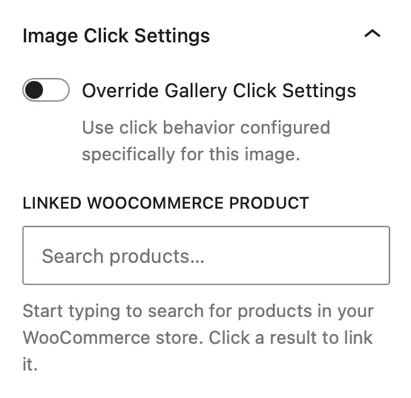
When the Image Click Behavior setting on the gallery block is set to WooCommerce Product, you can then select any individual Image Block within the gallery and link it directly to a product in your WooCommerce store.
To do this, open the Image Block’s Settings panel and expand the Image Click Settings panel. There you’ll find a searchable field that lets you quickly find and select any product from your WooCommerce catalog.
For faster access, a Shopping Cart button is also available in the Image Block toolbar. Clicking this button opens the same product selection interface.
Gallery Hover Settings
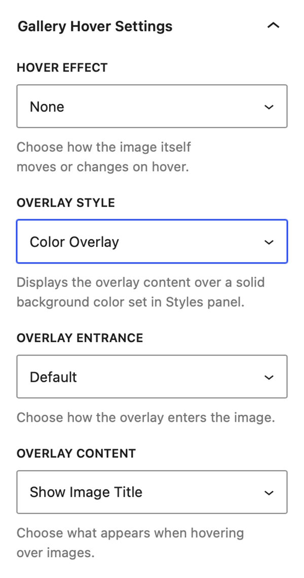
From the Gallery Hover Settings panel, you can control image hover effects, overlay styles, overlay animations, and the content displayed when visitors hover over gallery images.
Hover Effect
The Hover Effect dropdown allows you to select from the following effects:
- None
- Desaturate
- Glare
- Lift
- Pan
- Pop
- Tilt
- Zoom In
- Zoom Out
Overlay Style
The Overlay Style dropdown allows you to select from:
- None
- Blur Overlay
- Bottom Gradient Overlay
- Chip Overlay
- Chip Gradient Overlay
- Color Overlay
- Fade Overlay
- Gradient Overlay
Note: All Overlays have addition style controls that you can customize by going to the gallery block’s Styles panel and the Gallery Hover Styles section.
Overlay Entrance
The Overlay Entrance dropdown allows you to select how the overlay enters over the thumbnail. You can select from:
- Default
- Fade
- Slide Up
- Slide Down
- Slide Left
- Slide Right
Overlay Content
The Overlay Content dropdown allows you to select what displays inside the overlay when you hover over an image. You can select from:
- Show Image Title
- Show Image Caption
- Show EXIF Data
- Show Social Media
- Show Product Info
Note: Show Product Info option is only available when gallery or image is linked to WooCommerce.
Watermark Overlay
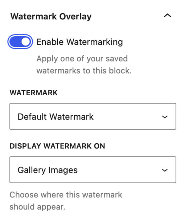
The Watermark Overlay panel lets you set all the settings for watermark overlays.
Enable Watermarking
This toggle enables Watermark Overlays for the gallery. You need to create at least one saved watermark in FolioBlocks → Global Settings before watermarking can be enabled. If no saved watermarks exist, the panel will show a notice asking you to create one first.
Watermark
The Watermark dropdown lets you select the watermark to use on the gallery. It will default to the Default Watermark but if you have multiple watermarks saved you can select one of the others.
Display Watermark On
This dropdown lets you select where you will display the watermark. You can choose from:
- Gallery Images
- Lightbox
- Gallery Images + Lightbox
Gallery Styles Panel
Background
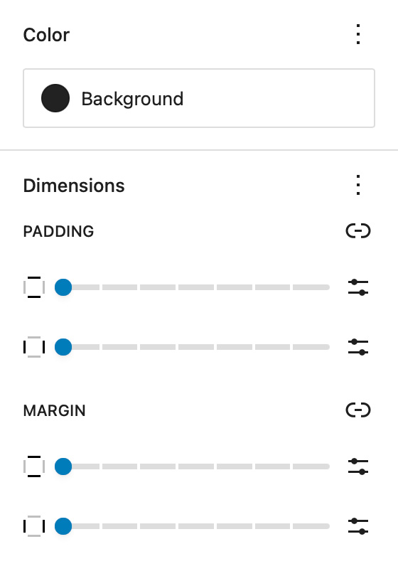
The Background setting allows you to customize the backdrop behind your Modular Gallery block. You can choose any color from your theme palette or define a custom color to help your images stand out or blend seamlessly with the surrounding layout.
A subtle background tone can make white borders or drop shadows more visible, while a dark background often enhances contrast and gives a cinematic look.
Dimensions – Padding & Margin
The Padding and Margin controls give you fine-grained control over the spacing inside and around your Modular Gallery block.
Use Padding to create breathing room between your gallery content and its edges — useful for highlighting the gallery within a colored background.
Use Margin to control the outer spacing between the gallery and adjacent blocks or page sections, ensuring perfect alignment and balance within your overall page design.
Gallery Image Styles
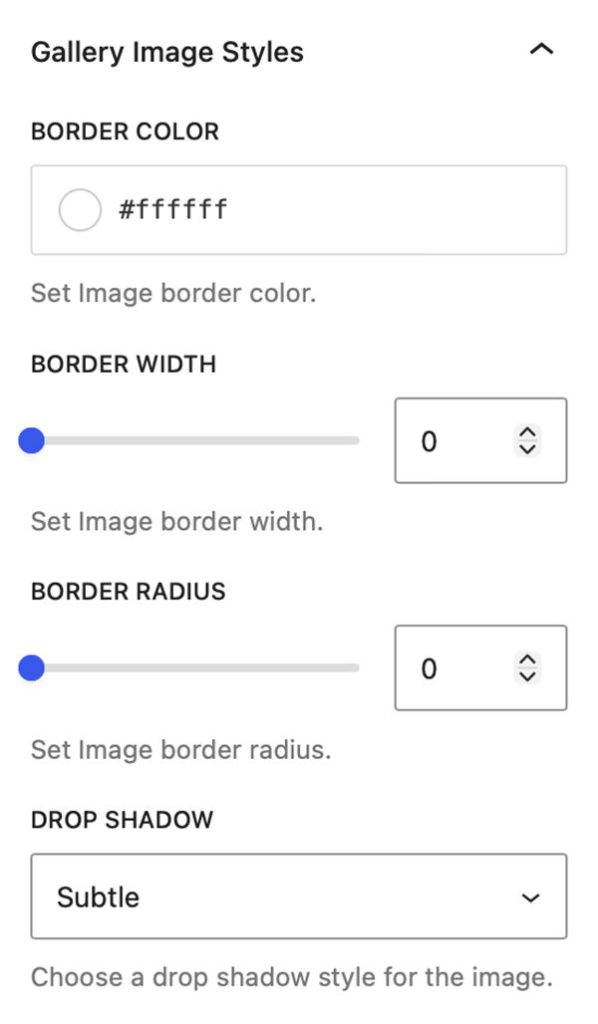
Border Color, Width, & Radius
These settings allow you to add custom borders to the images in your gallery. Select the color of your border and then adjust the border width slider to your liking.
The images in the editor update in real time so you can see how they look without having to visit the front end of the site.
The Border Radius slider allows you to add a radius to the corner of the images to further create special effects.
Drop Shadow
The Drop Shadow dropdown allows you to select from a variety of Drop Shadow effects and apply them to the thumbnail images in your gallery. You can select from the following types of Drop Shadow:
- None
- Subtle
- Soft
- Elevated
- Dramatic
Gallery Hover Styles
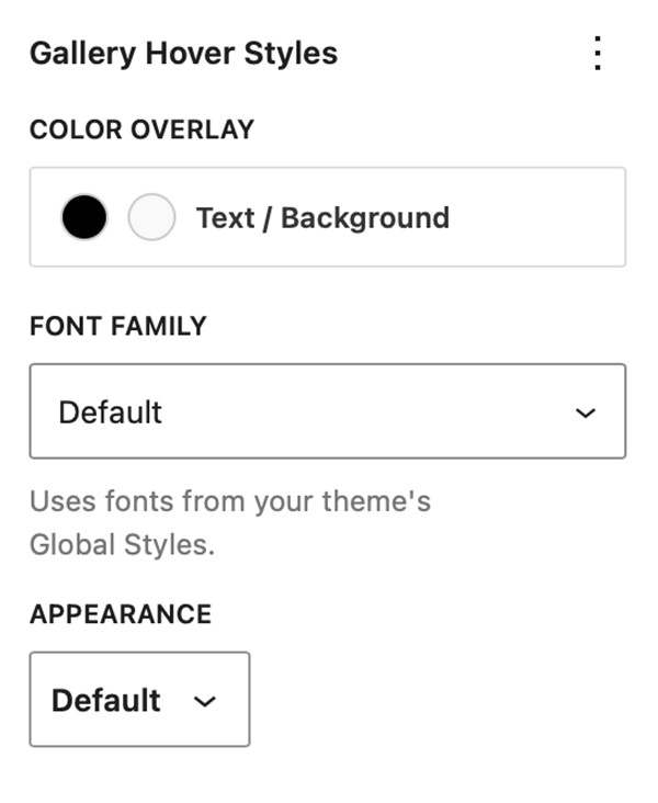
The Gallery Hover Styles panel displays in the gallery block’s Styles section only when Overlays are active in the gallery.
Color
These settings display only for the following overlay types: Color Overlay, Gradient Overlay, Chip Overlay, and Chip Gradient Overlay. They allow you to set the text color and background color in the overlay.
Font Family & Appearance
If you are using a block-based theme FolioBlocks will pick up font’s loaded in the theme and make them available to the overlays in this Font Family dropdown control.
While the Appearance dropdown control lets you set the font’s weight.
Per-Image Overrides for Gallery Click & Hover Settings
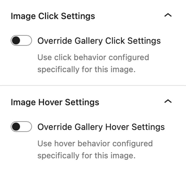
Individual Image Blocks within any gallery block can override the gallery’s default Gallery Click Settings and Gallery Hover Settings.
Simply select an image inside the gallery and enable either Override Gallery Click Settings or Override Gallery Hover Settings in the Image Block’s Settings panel. Once enabled, the same controls available at the gallery level become available for that specific image, allowing you to customize its behavior independently of the rest of the gallery.
This feature unlocks a new level of creative flexibility. For example, you can create a gallery where most images open in the Lightbox, while selected images link to pages, posts, external URLs, or WooCommerce products. You can also mix and match hover effects, giving individual images their own overlay colors, metadata displays, animations, and interactive behaviors.
The result is a gallery experience that can be tailored on an image-by-image basis, making it easier than ever to highlight important content, guide visitors through your site, or create more engaging visual layouts.
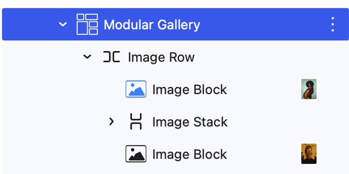
To help you keep track of what gallery images have overrides enabled the Image Block’s icon will turn blue when either Override Gallery Click Settings or Override Gallery Hover Settings are active.
Page/Post Settings
Starting with FolioBlocks 1.4, several controls that were previously located in the block’s Advanced settings have been moved to a dedicated FolioBlocks Page Settings panel in the Page/Post sidebar.
These features operate at the page level rather than the individual block level, so moving them out of the block settings creates a more intuitive editing experience and prevents the same feature from being enabled multiple times when a page contains several FolioBlocks blocks.
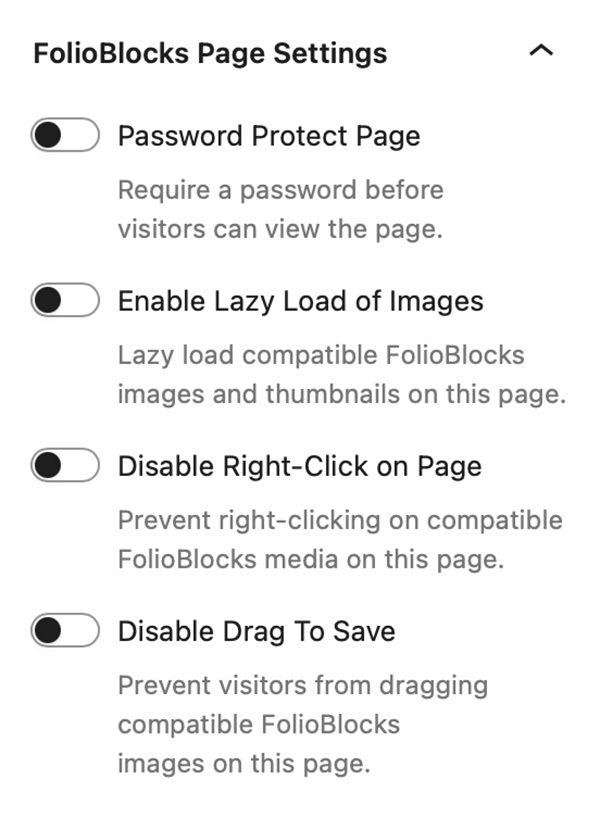
The FolioBlocks Page Settings panel is automatically added to the Page or Post sidebar whenever a FolioBlocks block is inserted into the WordPress editor. From this central location, you can configure settings that apply across the entire page, including the following features:
Password Protect Page
Requires a password before visitors can view the page.
Disable Right-Click on Page
Attempts to disable right-click to discourage casual image downloads.
Note: This makes it harder for casual users to save images, but it’s not foolproof — advanced users can still access media via the browser’s developer tools or view source.
Enable Lazy-Load of Images
When active, images load as the user scrolls, improving initial page load speed.
Disable Drag To Save
Prevents visitors from being able to drag images out of the browser to save them.
Example Modular Gallery
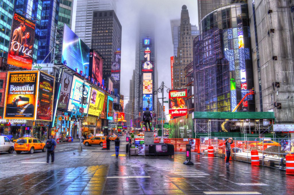
Below is an example of the Modular Gallery created with FolioBlocks:












Common Questions
How many images can I add?
Image Rows support up to 8 images and Image Stacks support up to 4 images.
Can I reorder or replace images?
Yes — you can drag to reorder images within each row or rearrange entire rows via the List View panel. Images can be dragged from one row to another and in and out of Image Stacks.
Does it work with my theme?
For the best experience it is recommended to use a block based theme. However FolioBlocks does work with classic themes provided they support wp_block_styles and the block editor.
Does the Modular Gallery Block work with my version of WordPress?
The Modular Gallery Block requires WordPress 6.5 or higher. Some newer FolioBlocks features require WordPress 7.0 or higher, so for the best experience we recommend keeping WordPress updated to the latest version, especially when using modern block themes and newer editor features.
Get Started
Ready to design your first modular gallery? Get FolioBlocks and start building professional, story-driven photo layouts in the WordPress Block Editor today.