
The Before & After Block in Folioblocks lets you compare images side by side with a draggable slider — perfect for showing edits, transformations, or progress over time — all directly inside the WordPress Block Editor (Gutenberg).
Note: This guide covers features available in the Professional (Pro) version of Folioblocks. Some options and settings described here may not be included in the free version.
Table of Contents
What Is the Before & After Block?
The Before & After Block provides an elegant way to compare two related images within a single frame. Visitors can drag a slider to reveal either image, creating a smooth, interactive transition.
This layout is popular among photographers, designers, and businesses who want to highlight before-and-after effects, retouching work, restorations, or renovation results.
Perfect for:
- Photo editing and retouching comparisons
- Design makeovers and color grading examples
- Home renovation or product restoration images
- Beauty, health, and transformation portfolios
How to Add the Before & After Block
1. Insert the Block
In the WordPress Block Editor, click the ➕ Add Block button and search for “Before & After.” You’ll find it under the Folioblocks section.
2. Upload or Select Your Images
With the Before & After Block added into the Editor you can use the Select Before Image and Select After Image buttons to select your two images.
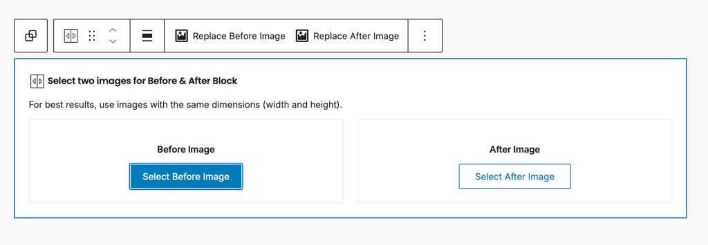
Both images will appear in the same frame with a draggable slider dividing them.
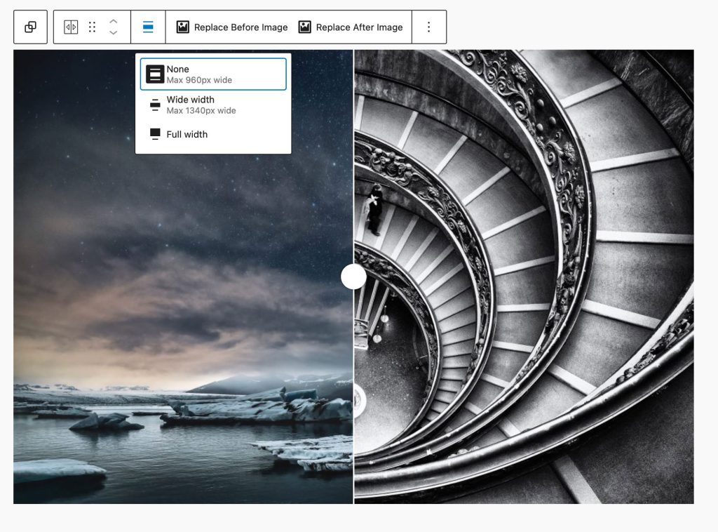
3. Adjust the Width & Replacing images
Observe the block toolbar which includes options to change the block width (Content, Wide, & Full) and also has buttons to replace both the Before and After images.
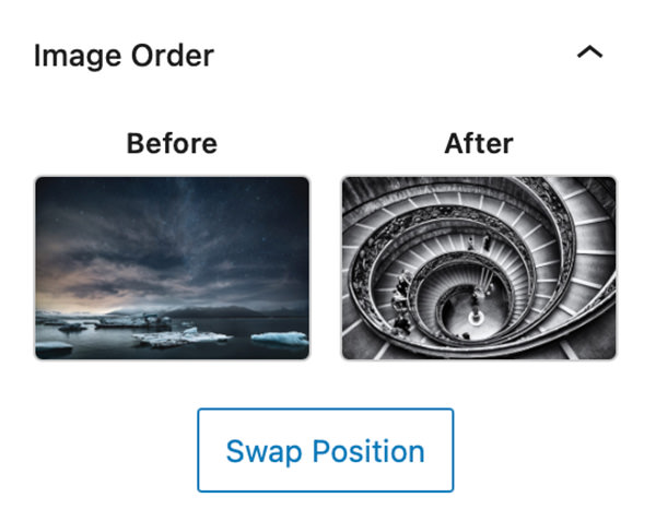
4. Image Order – Swap Position
This first section in the blocks settings panel gives you an option to swap the order of images.
General Block Settings

Resolution
Choose between Thumbnail, Medium, Large, or Full image sizes to balance sharpness and page load speed.
Slider Orientation
Set the orientation of your slider. Horizontal is ideal for landscape images, while vertical works well for portrait formats or product shots.
Drag Handle Starting Position
Set where the comparison slider begins — for example, 50% (center), 30%, or 70% — depending on which image you want to emphasize.
Show Before & After Labels
Display “Before” and “After” text labels directly on the slider for clear context.
When this is active an additional setting is added that allows you to set the label placement choosing between Top, Center, Bottom when on Horizontal orientation and Left, Center, Right when set to Vertical orientation.
Disable Right-Click on Page
Blocks right-click functionality to discourage casual image saving.
Note: This adds a layer of protection but cannot prevent image access through browser developer tools or page source.
Enable Lazy-Load of Images
Load images only when they become visible in the pages viewport, improving page load speed and performance.
Block General Styles
Background
The Background setting allows you to customize the backdrop behind your Before & After block. You can choose any color from your theme palette or define a custom color to help your images stand out or blend seamlessly with the surrounding layout.
A subtle background tone can make white borders or drop shadows more visible, while a dark background often enhances contrast and gives a cinematic look.
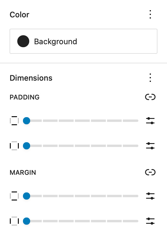
Dimensions – Padding & Margin
The Padding and Margin controls give you fine-grained control over the spacing inside and around your Before & After block.
Use Padding to create breathing room between your gallery content and its edges — useful for highlighting the gallery within a colored background.
Use Margin to control the outer spacing between the gallery and adjacent blocks or page sections, ensuring perfect alignment and balance within your overall page design.
Border & Shadow
Border Color, Width, and Radius
Add or adjust borders around your before and after images to match your theme design. Rounded corners can help soften the visual edges of your gallery.
Drop Shadow
Add depth and contrast with subtle shadows — especially effective when your slider is displayed on white or neutral backgrounds.

Before & After Block Styles

Slider Handle & Line Color
Change the color of the slider handle and line.
Label Text Color & Label Background Color
Change the color and background color of the “Before” and “After” labels.
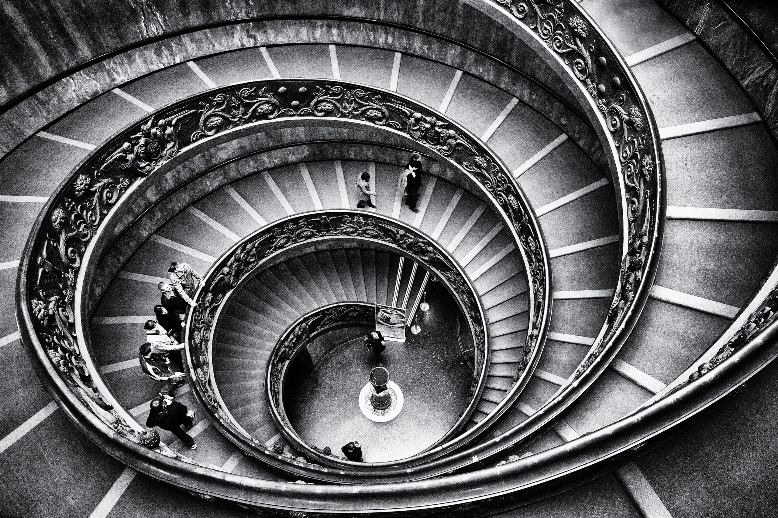
Example Before & After Block
Bellow is an example of the Before & After Block created with Folioblocks:

Common Questions
How many Before & After sliders can I add?
You can add as many Before & After blocks as you like on a single page. Each block operates independently.
Can I use portrait and landscape images together?
There is nothing stoping you from using images that do not match, but obviously for the best results use two images with the same pixel size and dimensions. That will ensure everything aligns properly.
Does it work with my WordPress theme?
Yes. The Before & After Block automatically inherits your theme’s color palette, typography, and border settings.
Is it compatible with WordPress 6.x or newer?
Absolutely. The Before & After Block is built for the WordPress Block Editor (Gutenberg) and fully optimized for modern WordPress versions.
Get Started
Ready to showcase your transformations with style? Get Folioblocks and start creating interactive Before & After comparisons in the WordPress today.