Updated: May 28th, 2026 for FolioBlocks Version 1.3
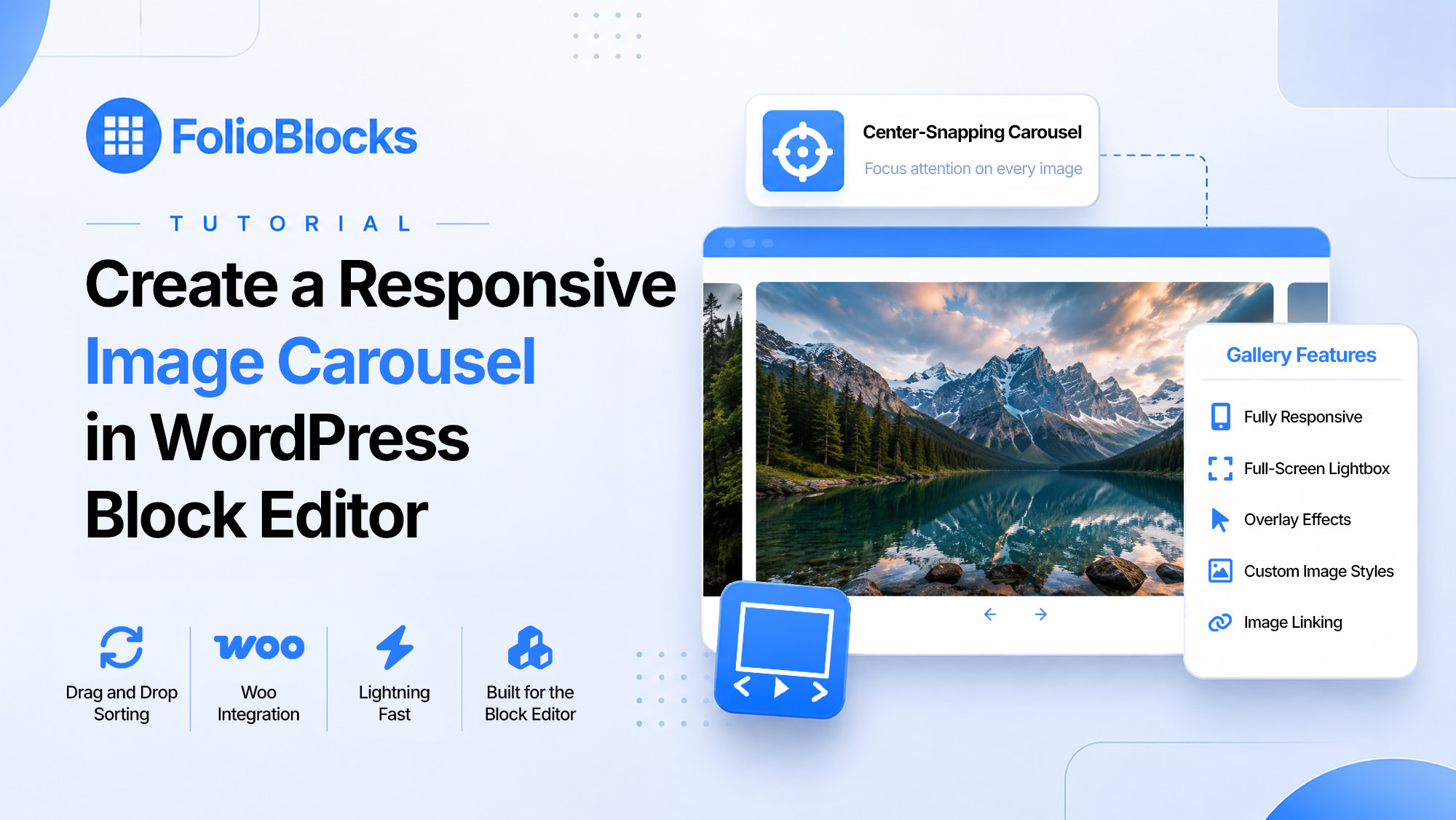
The Carousel Gallery Block in FolioBlocks lets you create smooth, swipe-able image carousels directly inside the WordPress Block Editor (Gutenberg). Designed for photographers, designers, and creatives, this block provides a fast, lightweight way to showcase your best images with elegant transitions and full control over playback behavior.
Note: This article focuses on the Professional (Pro) version of FolioBlocks. Some of the features described here may not be available in the free version.
Table of Contents
What Is the Carousel Gallery Block?
The Carousel Gallery Block is a dynamic, responsive slider that displays one image at a time (or several, depending on your settings) while allowing visitors to navigate through your gallery using arrows, dots, or swipe gestures.
Unlike static gallery layouts such as Grid or Masonry, the Carousel layout emphasizes one image at a time, making it perfect for hero sections, project showcases, and storytelling sequences. It’s powered entirely by modern WordPress block technology — no shortcodes, no heavy scripts.
Perfect for:
- Hero galleries and featured images
- Product or portfolio slideshows
- Event recaps or storytelling sequences
- Landing pages and homepage highlights
How to Add the Carousel Gallery Block
1. Insert the Block
In the WordPress Block Editor, click the ➕ Add Block button and search for “Carousel Gallery.” You’ll find it under the FolioBlocks section.
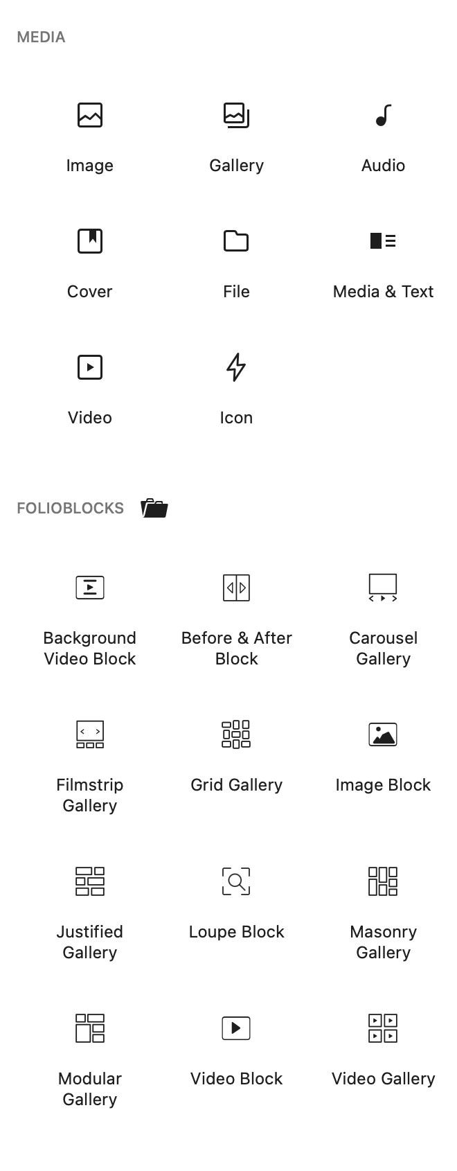
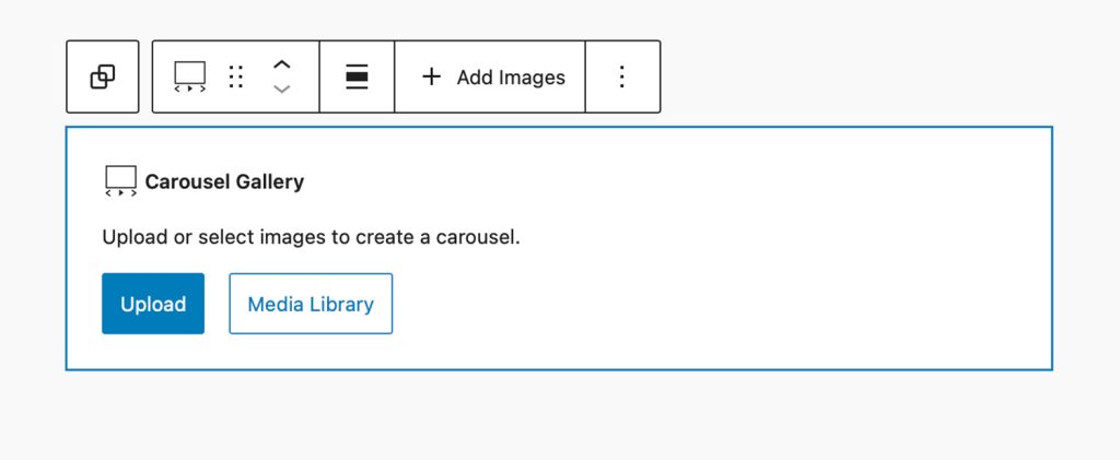
2. Upload or Select Images
Use the Media Library or Upload button to add your images.
You can insert multiple images at once and reorder them later using drag and drop or the List View sidebar.
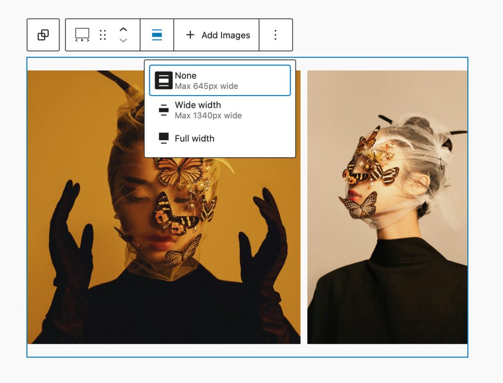
3. Adjust Gallery Width & Behavior
Use the toolbar alignment options to select Content Width, Wide Width, or Full Width.
Then, open the block settings panel to fine-tune autoplay, slide speed, and navigation controls.
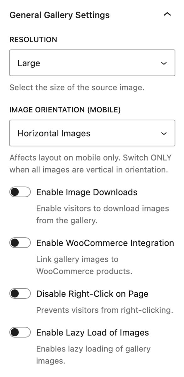
General Gallery Settings
Image Resolution
Choose between Thumbnail, Medium, Large, or Full image resolutions to balance sharpness with loading performance.
Image Orientation (Mobile)
The Carousel Gallery block is responsive out the box and doesn’t require you to change any settings. However if you have a Carousel where all your images are in a Portrait (vertical) orientation activate this setting and the responsive layout on mobile will be tuned to those images ensuring they fill up more of the available viewport.
Autoplay
Enable autoplay to let your carousel automatically cycle through images. You can adjust the autoplay speed (in seconds) to control pacing.
Navigation Controls
Show or hide navigation arrows and play/pause button (when Autoplay is activated). Visitors can also swipe between images on touch devices.
The alignment of the Carousel controls can be adjusted between Left, Center, and Right.
Note: Additional style options for the Carousel Controls are available in the blocks style settings panel.
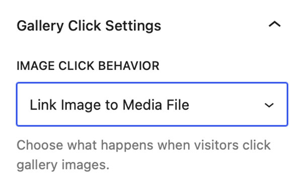
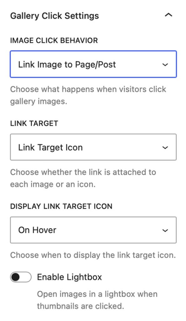
Gallery Click Settings
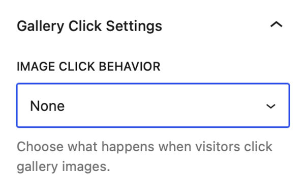
As of version 1.3 of FolioBlocks all features related to what happens when you click on a gallery images are grouped into a panel called Gallery Click Settings. Clicking on the Image Click Behavior drop down reveals the following options: None, Open in Lightbox, Enable Image Downloads, Link Image to Media File, Link Image to Custom URL, Link Image to Page/Post, or WooCommerce Product.
Note: WooCommerce Product only displays is WooCommerce is installed and active
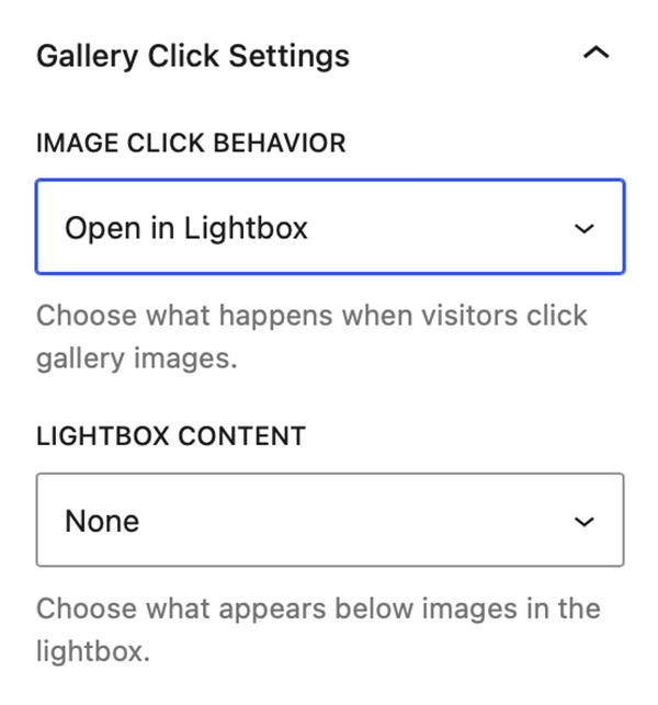
Lightbox
Selecting Open in Lightbox in the Image Click Behavior dropdown will activate the Lightbox on the website’s front-end. The Lightbox supports keyboard navigation and swipe gestures.
When Open in Lightbox is selected in Image Click Behavior An additional dropdown titled “Lightbox Content” allows you to select what displays inside of the Lightbox alongside the image. You can select from: None, Show Image Title, Show Image Caption, or Show EXIF Data.
Enable Image Downloads
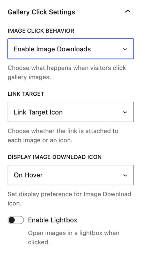
Selecting Enable Image Downloads in the Image Click Behavior dropdown will make all of the gallery images link to the source file so they are available for download in the front-end of the website.
The Link Target dropdown allows to decide if you want the link to be placed on an icon or on the thumbnail image. The Display Image Download Icon drop down allows you select if the Download icon is always visible or only visible on hover.
Note: With Enable Image Downloads selected an additional control is added into the gallery block’s Styles panel. This control allows you to set the color of the Download icon as well as its background color.
Finally the Enable Lightbox control allows you to toggle the Lightbox on and off. This is only available when Image downloads are set to Link Target Icon. With Enable Lightbox activated a further control allows you set what displays in the Lightbox alongside the image. With Image Title, Caption, and EXIF Data being options.
Link Image to Media File
Selecting Link Image to Media File in the Image Click Behavior dropdown will make all the gallery thumbnails link to their source file. However clicking the link will not trigger a download but open the source file in the browser.
This setting is useful is you want to use a 3rd party Lightbox rather than the Lightbox that is included with FolioBlocks.
Link Image to Custom URL
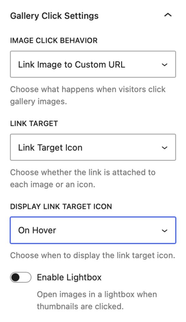
Selecting Link Image to Custom URL in the Image Click Behavior dropdown will allow you to link the gallery images to custom urls. Linking is done on the individual Image blocks from a search field that is added to their Settings panel.
Note: Images that are not linked will not have an empty hyperlink added.
The Link Target dropdown allows to decide if you want the link to be placed on an icon or on the thumbnail image. The Display Link Target Icon drop down allows you select if the Link icon is always visible or only visible on hover.
Note: With Link Image to Custom URL selected an additional control is added into the gallery block’s Styles panel. This control allows you to set the color of the Link icon as well as its background color.
Finally the Enable Lightbox control allows you to toggle the Lightbox on and off. This is only available when Image downloads are set to Link Target Icon. With Enable Lightbox activated a further control allows you set what displays in the Lightbox alongside the image. With Image Title, Caption, and EXIF Data being options.
Link Image to Page/Post
Selecting Link Image to Page/Post in the Image Click Behavior dropdown will allow you to link the gallery images to Pages or Posts on your WordPress site. Linking is done on the individual Image blocks from a search field that is added to their Settings panel.
Note: Images that are not linked will not have an empty hyperlink added.
The Link Target dropdown allows to decide if you want the link to be placed on an icon or on the thumbnail image. The Display Link Target Icon drop down allows you select if the Link icon is always visible or only visible on hover.
Note: With Link Image to Page/Post selected an additional control is added into the gallery block’s Styles panel. This control allows you to set the color of the Link icon as well as its background color.
Finally the Enable Lightbox control allows you to toggle the Lightbox on and off. This is only available when Image downloads are set to Link Target Icon. With Enable Lightbox activated a further control allows you set what displays in the Lightbox alongside the image. With Image Title, Caption, and EXIF Data being options.
WooCommerce Product
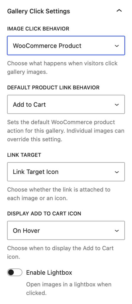
Selecting WooCommerce Product from the Image Click Behavior dropdown will allow you to link the gallery images to WooCommerce products in your WordPress website. Linking is done on the individual Image blocks from a search field that is added to their Settings panel.
Note: Option will only be available when the WooCommerce plugin is installed and active. Images that are not linked will not have an empty hyperlink added.
The Default Product Link Behavior dropdown allows to decide if you want the link to add a product to your shopping cart or if you want the link to go to the selected product’s page.
The Link Target dropdown allows to decide if you want the link to be placed on an icon or on the thumbnail image. The Display Add To Cart Icon drop down allows you select if the Link icon is always visible or only visible on hover.
Note: With WooCommerce Product selected an additional control is added into the gallery block’s Styles panel. This control allows you to set the color of the Add To Cart icon as well as its background color.
Finally the Enable Lightbox control allows you to toggle the Lightbox on and off. This is only available when the Link Target dropdown set to Link Target Icon. With Enable Lightbox activated a further control allows you set what displays in the Lightbox alongside the image. With Image Title, Caption, EXIF Data, and WooProduct details being options.
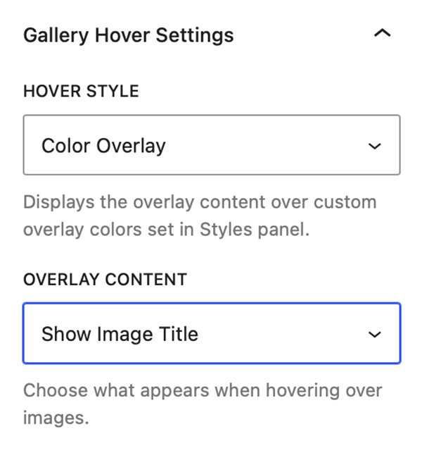
Gallery Hover Settings
From the Gallery Hover Settings panel you can set if images will display an overlay when you hover over them. The Hover Style dropdown allows you to select from a Blur, Fade, Gradient, Chip, or Color Overlay.
Notes: With the Color Overlay selected you can additionally customize the color of the text and background of the Overlay by going to the Styles panel and the Gallery Hover Styles section.
The Overlay Content drop down allows you to select what displays inside the overlay when you hover above an image. You can select from Show Image Title, Show Image Caption, Show EXIF Data, or Show Product Info.
Notes: Show Product Info option is only available when gallery is linked to WooCommerce.
Advanced Settings
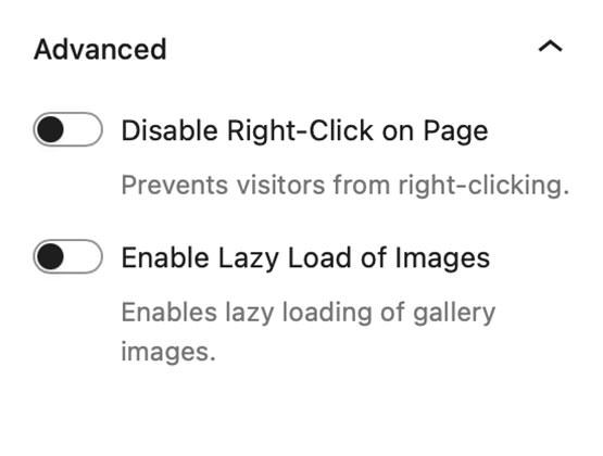
Disable Right-Click on Page
Blocks right-click functionality to discourage casual image saving.
Note: This adds a layer of protection but cannot prevent image access through browser developer tools or page source.
Enable Lazy-Load of Images
Load images only when they become visible in the carousel viewport, improving page load speed and performance.
Gallery Styles Panel
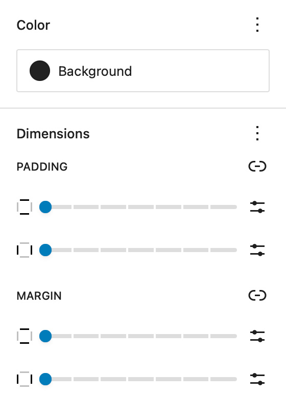
Background
The Background setting allows you to customize the backdrop behind your Carousel Gallery block. You can choose any color from your theme palette or define a custom color to help your images stand out or blend seamlessly with the surrounding layout.
A subtle background tone can make white borders or drop shadows more visible, while a dark background often enhances contrast and gives a cinematic look.
Dimensions – Padding & Margin
The Padding and Margin controls give you fine-grained control over the spacing inside and around your Carousel Gallery block.
Use Padding to create breathing room between your gallery content and its edges — useful for highlighting the gallery within a colored background.
Use Margin to control the outer spacing between the gallery and adjacent blocks or page sections, ensuring perfect alignment and balance within your overall page design.
Carousel Control Styles
Control Background Color & Control Icon Color
These settings allow you to change the Background Color and Icon Color on the Carousel control buttons.

Gallery Image Styles
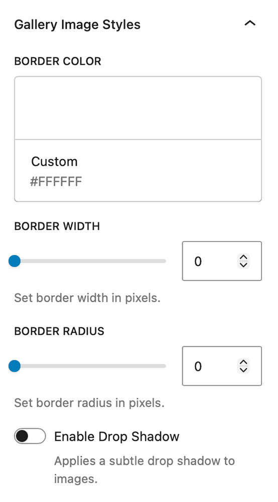
Border Color, Width, & Radius
These settings allow you to add custom borders to the images in your gallery. Select the color of your border and then adjust the border width slider to your liking.
The images in the editor update in real time so you can see how they look without having to visit the front end of the site.
Border Radius slider allows you to add a radius to the corner of the images to further create special effects.
Enable Drop Shadow
Enable Drop Shadow adds a subtle drop shadow to your images that helps them pop off the page.
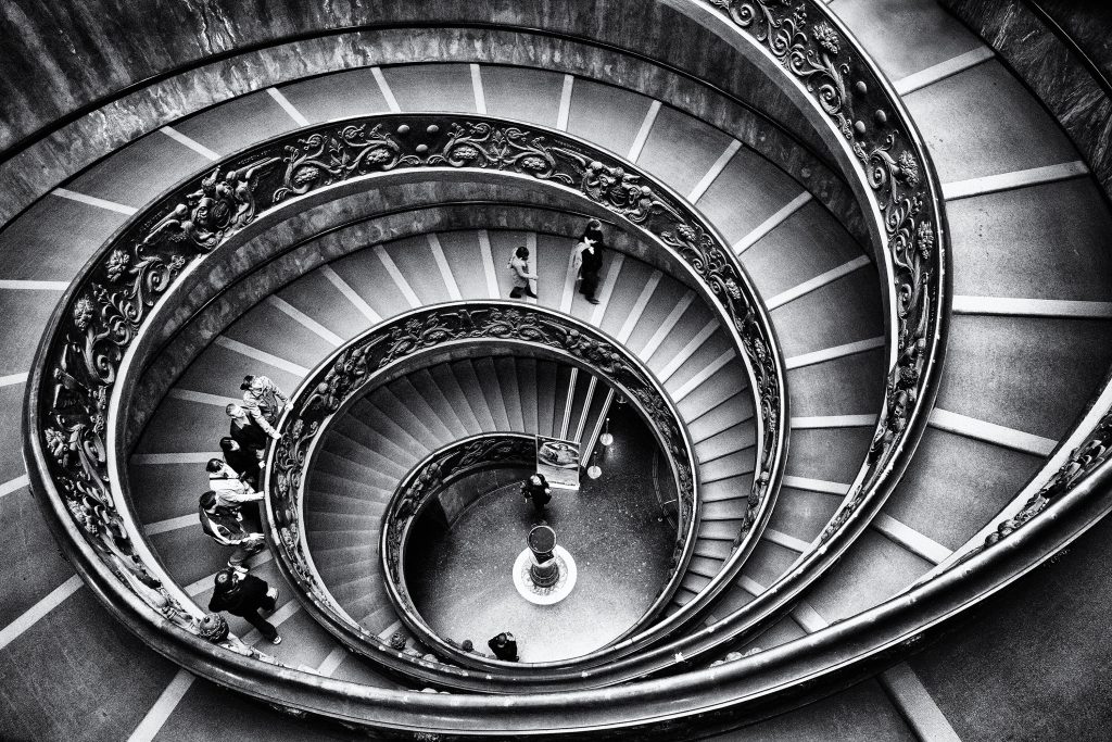
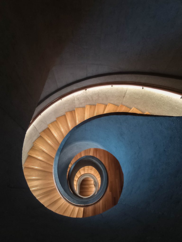
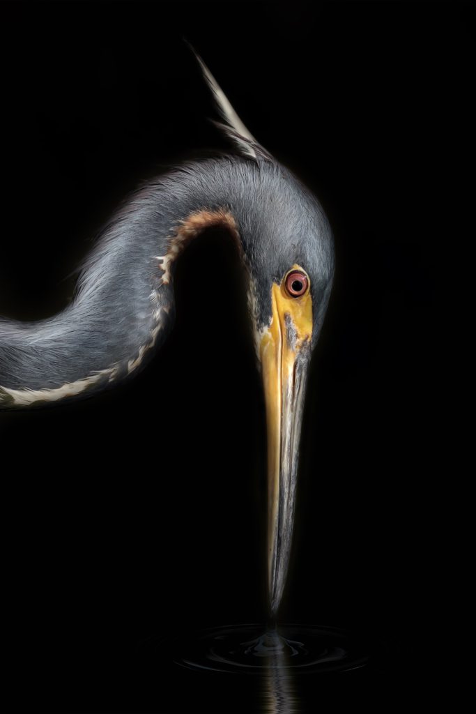
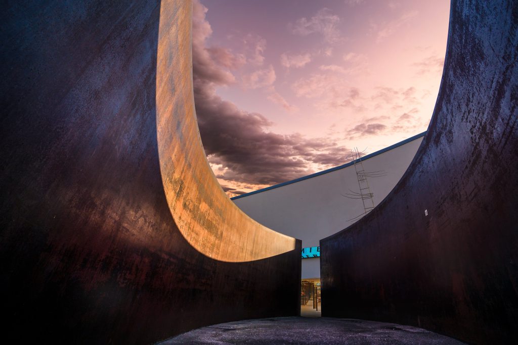
Example Carousel Gallery
Below is an example of a Carousel Gallery created with FolioBlocks:


Common Questions
How many images can I add?
There are no limits on how many images you can add.
Can I mix portrait and landscape images?
Yes, the Carousel gallery automatically sizes all images to a uniform height. If using only portrait images it is recommended to turn the Image Orientation setting to Vertical Images.
Does it work with my theme?
For the best experience it is recommended to use a block based theme. However FolioBlocks does work with classic themes provided they support wp_block_styles and the block editor.
Is it compatible with WordPress 6.x or newer?
Absolutely. The Carousel Gallery Block is built for the WordPress Block Editor (Gutenberg) and fully supports the latest WordPress versions.
Get Started
Ready to create your first responsive image carousel? Get FolioBlocks and start building professional, responsive carousels in the WordPress Block Editor (Gutenberg) today.