
Updated: August 12th, 2026 for FolioBlocks Version 1.5 running on WordPress 7.0 or higher
Note: This article focuses on the Professional (Pro) version of FolioBlocks. Some of the features described here may not be available in the free version.
The Video Gallery Block in FolioBlocks lets you create modern, filterable video galleries directly inside the WordPress Block Editor (Gutenberg) — no shortcodes, no settings screens, no fuss.
With support for self-hosted videos and embeds from Bunny.net, Cloudflare Stream, Dailymotion, Loom, Vimeo, VideoPress, Wistia, and YouTube, it’s an easy way to showcase professional video collections in a responsive, visually engaging layout.
Table of Contents
What Is the Video Gallery Block?
The Video Gallery Block makes it effortless to display multiple videos in a clean, customizable grid — complete with hover effects, category filtering, and built-in Lightbox playback.
Each video can have its own thumbnail, title, and caption, while filters let visitors browse different categories or topics without leaving the page.
Perfect for:
- Filmmakers and videographers showcasing portfolios
- Agencies or educators organizing video tutorials
- Brands displaying campaign or product videos
- Anyone wanting a stylish, filterable video gallery inside Gutenberg
How to Add the Video Gallery Block
1. Insert the Block
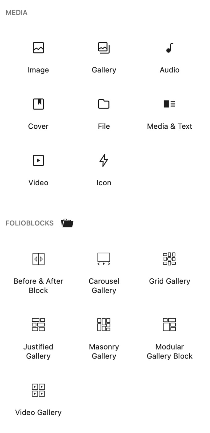
In the WordPress Block Editor, click the ➕ Add Block button and search for “Video Gallery.” You’ll find it under the FolioBlocks section.
Another option to add the block is to type / followed by the block name (Video Gallery) from inside the block editor.
2. Add Videos
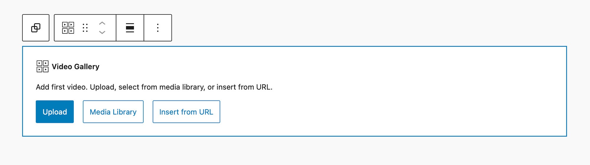
With the block added to the editor you are prompted to add your first video.
You can Upload videos, add videos from your Media Library, or use Insert from URL to embed videos from the listed providers.
- Bunny.net
- Cloudflare Stream
- Dailymotion
- Loom
- Vimeo
- VideoPress
- Wistia
- YouTube
3. Add Thumbnails and Details
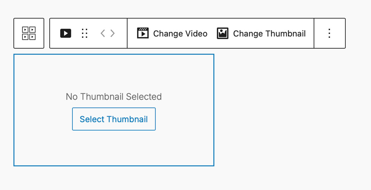
After inserting your video, you are prompted to set a custom thumbnail image. Thumbnails can be uploaded manually or selected from the media library.
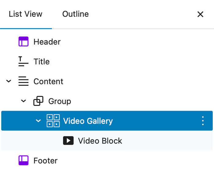
Just like the photo gallery blocks in FolioBlocks, the Video Gallery block creates your videos as InnerBlocks. If you now look at your block structure in the List View it should look like this:
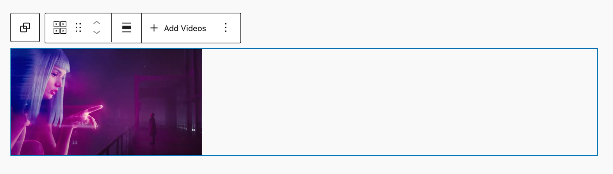
If you select the main Video Gallery block you can see options in the block toolbar to set the Width (Content, Wide, Full) as well as to + Add Videos as seen in the image below:
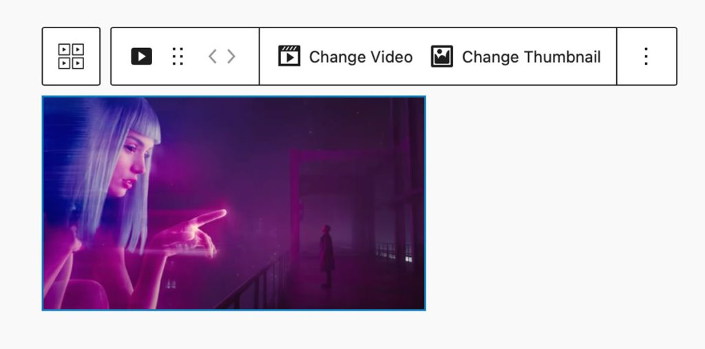
Selecting the inner Video block in the List View will instead show you the block toolbar for that Video block. There you will find options to Change Video and Change Thumbnail as seen below:
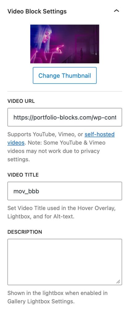
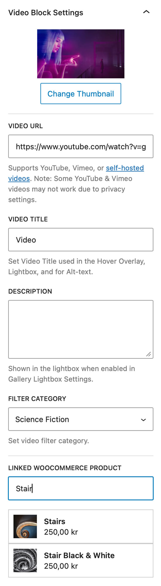
With the inner Video block selected you also get access to its settings panel. Here you will find settings to change the video source file, to set the title for your video, and to set a description for your video.
The title can be displayed when you hover over the video block. While the description can be set to be displayed inside of the video Lightbox.
General Gallery Settings
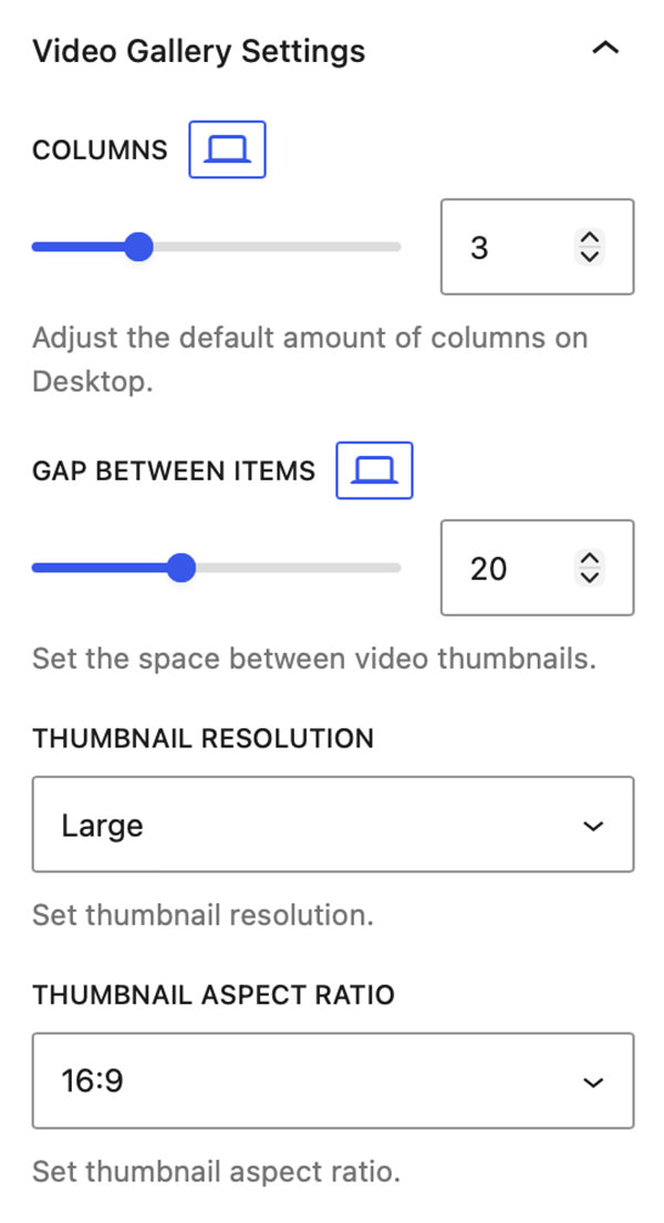
With the main Video Gallery block selected you can access the block’s settings panel, the first of which contains the Video Gallery Settings panel.
Columns
Set how many columns to show on Desktop, Tablet, and Mobile.
Gap Between Items
The Gap Between Items slider allows you to define the amount of space between the video thumbnails with options to set different values for Desktop, Tablet, and Mobile.
Thumbnail Resolution
Choose among Thumbnail, Medium, Large, or Full — balancing quality and page load performance.
Thumbnail Aspect Ratio
Set the aspect ratio for the galleries video blocks.
Gallery Click Settings
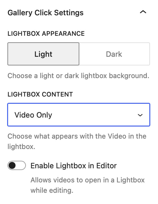
Lightbox Appearance
This setting allows you to switch between Light & Dark mode in the Video Lightbox.
Lightbox Content
This setting allows you to choose what is displayed in the Lightbox alongside your video. Options include:
- Video Only
- Video + Info
- Video + Product Info
Note: Video + Product Info is only available when Enable WooCommerce Integration is active.
Enable Lightbox in Editor
This feature allows you to open the Lightbox in the WordPress Block Editor so you can examine how it looks.
Gallery Hover Settings
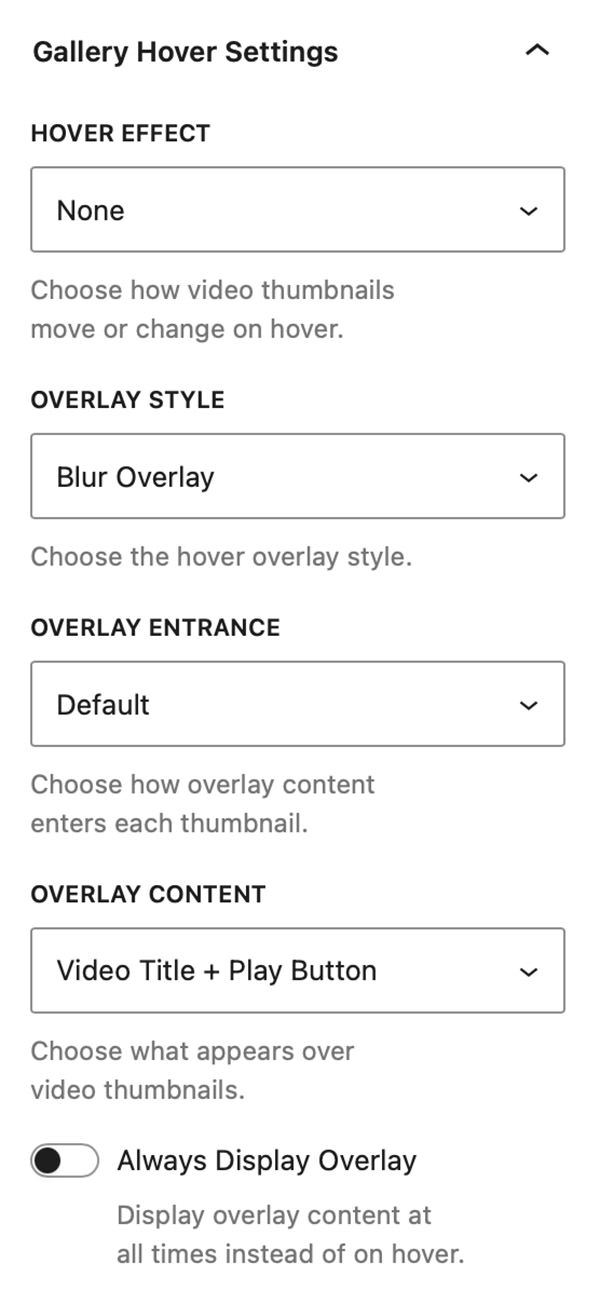
From the Gallery Hover Settings panel, you can control video hover effects, overlay styles, overlay animations, and the content displayed when visitors hover over video thumbnails.
Hover Effect
The Hover Effect dropdown lets you select from the following effects:
- None
- Desaturate
- Glare
- Lift
- Pan
- Pop
- Tilt
- Zoom In
- Zoom Out
Overlay Style
The Overlay Style dropdown lets you select a style for your hover overlay. You can choose from:
- Default Overlay
- Blur Overlay
- Color Overlay
- Gradient Overlay
Note: Overlays add an additional component to the Video Gallery Block’s styles panel that allows you to set color & typography styles.
Overlay Entrance
The Overlay Entrance dropdown allows you to select how the overlay enters over the thumbnail. You can select from:
- Default
- Fade
- Slide Up
- Slide Down
- Slide Left
- Slide Right
Overlay Content
The Overlay Content dropdown allows you to select what is displayed inside the overlay. You can select from:
- None
- Play Button
- Video Title
- Video Title + Play Button
- Video Title + Play Button + Filter Category
Note: Video Title + Play Button + Filter Category is only available when Enable Video Filtering is activated.
Always Display Overlay
Activate this toggle to always display the overlay above the Video Block’s thumbnail.
Gallery Filter Settings
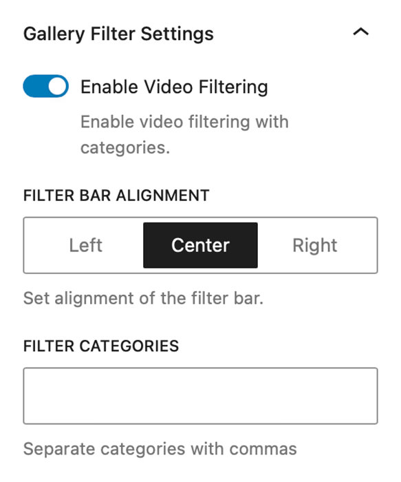
Enable Video Filtering
Turn on Enable Video Filtering to let users switch between categories using a clean filter bar above your video gallery.
You can add as many categories as you want (e.g., “Behind the Scenes,” “Commercials,” “Interviews”).
Assign Categories to Video Blocks
Once you have added all your categories on the main Video Gallery Block you can select the individual Video Blocks and in their block settings you will find a Filter Category drop down where you can select from your categories.

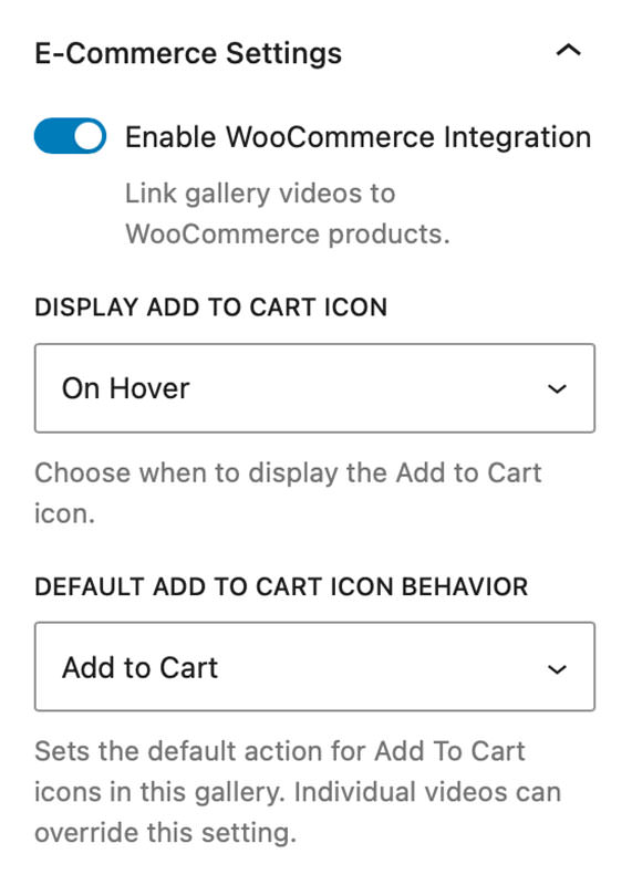
E-Commerce Settings
Enable WooCommerce Integration
Enables WooCommerce Integration allowing you to link gallery videos with WooCommerce products on your website. Instructions for WooCommerce integration are included later in this tutorial.
Note: The Enable WooCommerce Integration toggle will only display if WooCommerce plugin is installed and active on your website.
Display Add to Cart icon
With Enable WooCommerce Integration turned on you will be presented with a new select control that lets you choose if you want to always display the Add to Cart button or display it only hover.
Note: You can set the icon & background color for the Add To Cart icon by going to the Video Gallery Block’s styles panel when Enable WooCommerce Integration is active.
Set Add To Cart icon Behavior
The Default Add to Cart Icon Behavior select control allows you to set the default behavior of Add to Cart Icons for the entire gallery. You can choose between the default “Add To Cart” or linking to the product page.
This setting can be overridden on a video-by-video basis. Giving you the option to set one behavior for the gallery and then override it on videos as needed.
Linking Videos to WooCommerce Products
Linking your videos to products is super simple, with Enable WooCommerce Integration turned on simply select one of the video blocks in your gallery and look in its block settings.
You will see a new setting available, Linked WooCommerce Products, with an input field that allows you to search through all WooCommerce products on your site.
Simply search for your product and select it to link it with the video.
Note: The settings for Linked WooCommerce Products only appear when Enable WooCommerce Integration is active on the parent gallery block.
Block General Styles
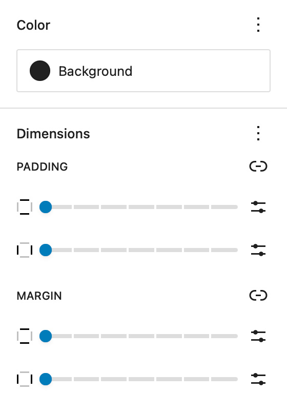
Background
Change the background color of the entire Video Gallery block.
Use a dark background to enhance contrast or a light background for a clean, minimal aesthetic.
Dimensions – Padding & Margin
Use Padding to control spacing inside the gallery container and Margin to adjust spacing around the gallery relative to nearby blocks.
This ensures perfect alignment across your layout.
Video Thumbnail Styles
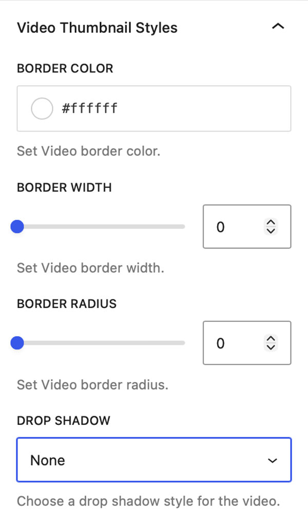
Border Color, Width, and Radius
Add borders around your video thumbnails to match your website’s design style. Rounded corners create a softer, modern look.
Drop Shadow
The Drop Shadow dropdown allows you to select from a variety of Drop Shadow effects and apply them to the thumbnail images in your gallery. You can select from the following types of Drop Shadow:
- None
- Subtle
- Soft
- Elevated
- Dramatic
Filter Bar Styles
When Enable Video Filtering is active the Filter Bar Styles panel will be present in the Video Gallery Block’s style panel.
Font-Family, Font Size, Appearance, Line Height, Letter Spacing, Decoration, & Letter Case
When using a block-based theme that uses theme.json FolioBlocks will detect available fonts and let you set the font for the Filter Bar. Additional controls allow you to set Font Size, Appearance, Line Height, Letter Spacing, Decoration, and Letter Case styles.
Active – Text Color & Active – Background Color
These two settings allow you to set the color and background color for the active term in the Filter Bar.
Inactive – Text Color & Inactive – Background Color
These two settings allow you to set the color and background color for the inactive terms in the Filter Bar.
Note: The font used in the Filter Bar for Active and Inactive terms is pulled from your theme’s body font.

Per-Video Overrides for Gallery Hover Settings
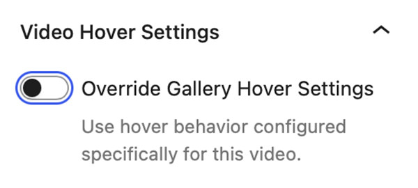
Starting with FolioBlocks 1.4, individual Video Blocks within the Video Gallery Block can now override the gallery’s default Gallery Hover Settings.
Simply select any Video Block inside the gallery and enable Override Gallery Hover Settings in the Video Block settings panel. Once enabled, the same controls available at the gallery level become available for that specific Video Block, allowing you to customize its behavior independently of the rest of the gallery.
This feature unlocks a new level of creative flexibility allowing you to mix and match hover effects, giving individual videos their own overlay colors, metadata displays, animations, and interactive behaviors.
Page/Post Settings
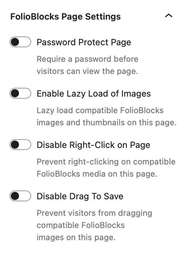
Starting with FolioBlocks 1.4, several controls that were previously located in the block’s Advanced settings have been moved to a dedicated FolioBlocks Page Settings panel in the Page/Post sidebar.
These features operate at the page level rather than the individual block level, so moving them out of the block settings creates a more intuitive editing experience and prevents the same feature from being enabled multiple times when a page contains several FolioBlocks blocks.
The FolioBlocks Page Settings panel is automatically added to the Page or Post sidebar whenever a FolioBlocks block is inserted into the WordPress editor. From this central location, you can configure settings that apply across the entire page, including the following features:
Password Protect Page
Requires a password before visitors can view the page.
Enable Lazy-Load of Images
When active, images load as the user scrolls, improving initial page load speed.
Disable Right-Click on Page
Attempts to disable right-click to discourage casual image downloads.
Note: This makes it harder for casual users to save images, but it’s not foolproof — advanced users can still access media via the browser’s developer tools or view source.
Disable Drag To Save
Prevents visitors from being able to drag images out of the browser to save them.
Example Video Gallery
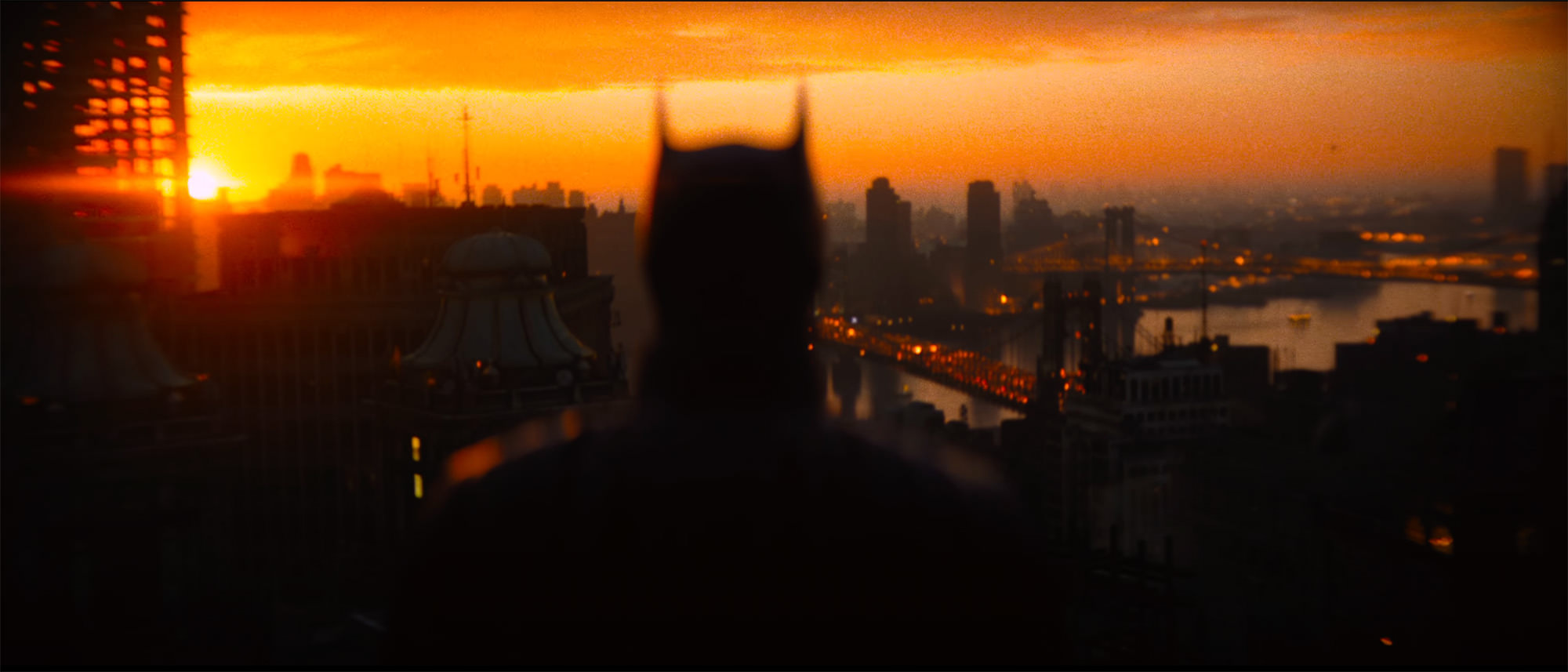
Below is an example of the Video Gallery Block with Video Filtering enabled:








Frequently Asked Questions (FAQ)
What video sources are supported?
You can use self-hosted MP4 files or embed videos from Bunny.net, Cloudflare Stream, Dailymotion, Loom, Vimeo, VideoPress, Wistia, and YouTube.
How many videos can I add?
There is no limit on how many videos you can add.
Can I mix videos from different sources?
Yes, you can mix self-hosted videos and supported embedded providers within the same gallery.
Does it work with my WordPress theme?
For the best experience, we recommend using a block-based theme. However, FolioBlocks does work with classic themes provided they support wp_block_styles and the block editor.
Does the Video Gallery Block work with my version of WordPress?
The Video Gallery Block requires WordPress 6.5 or higher. Some newer FolioBlocks features require WordPress 7.0 or higher, so for the best experience we recommend keeping WordPress updated to the latest version, especially when using modern block themes and newer editor features.
Get Started
Ready to build your first filterable video gallery? Get FolioBlocks and start creating professional video galleries in the WordPress Block Editor (Gutenberg) today.